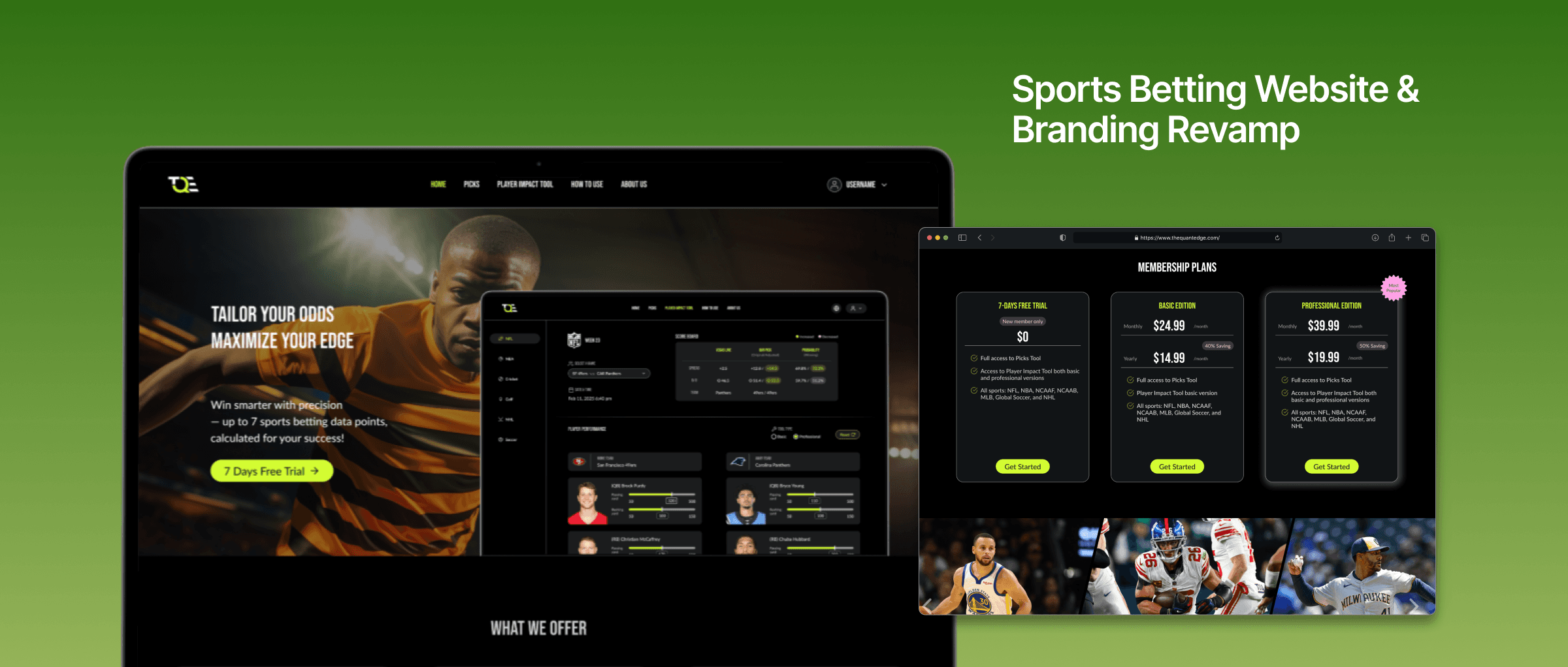
Redesign a sport betting website with brand new visual and increase responsiveness with desktop and mobile versions.
My Role
UX/UI Designer
Consultant
Team
CEO
1 Designer
2 Developers
Company
The Quant Edge
01 / Context
Company Introduction
The Quant Edge, founded in 2018, is a company specializing in the sports betting industry. It offers an online platform with advanced tools to calculate odds and other performance metrics, empowering users to make better-informed betting decisions.
Problem Statement
How might we improve the interaction, look and feel to better align with our TA to drive user engagement and business growth?
02 / Solution
Total Revamp
Redesigned the user experience from interaction to visual elements, enhancing the overall look and feel. Implemented a new color scheme, refined typefaces, and an organized layout to establish clear hierarchy, enabling intuitive self-navigation throughout the website.
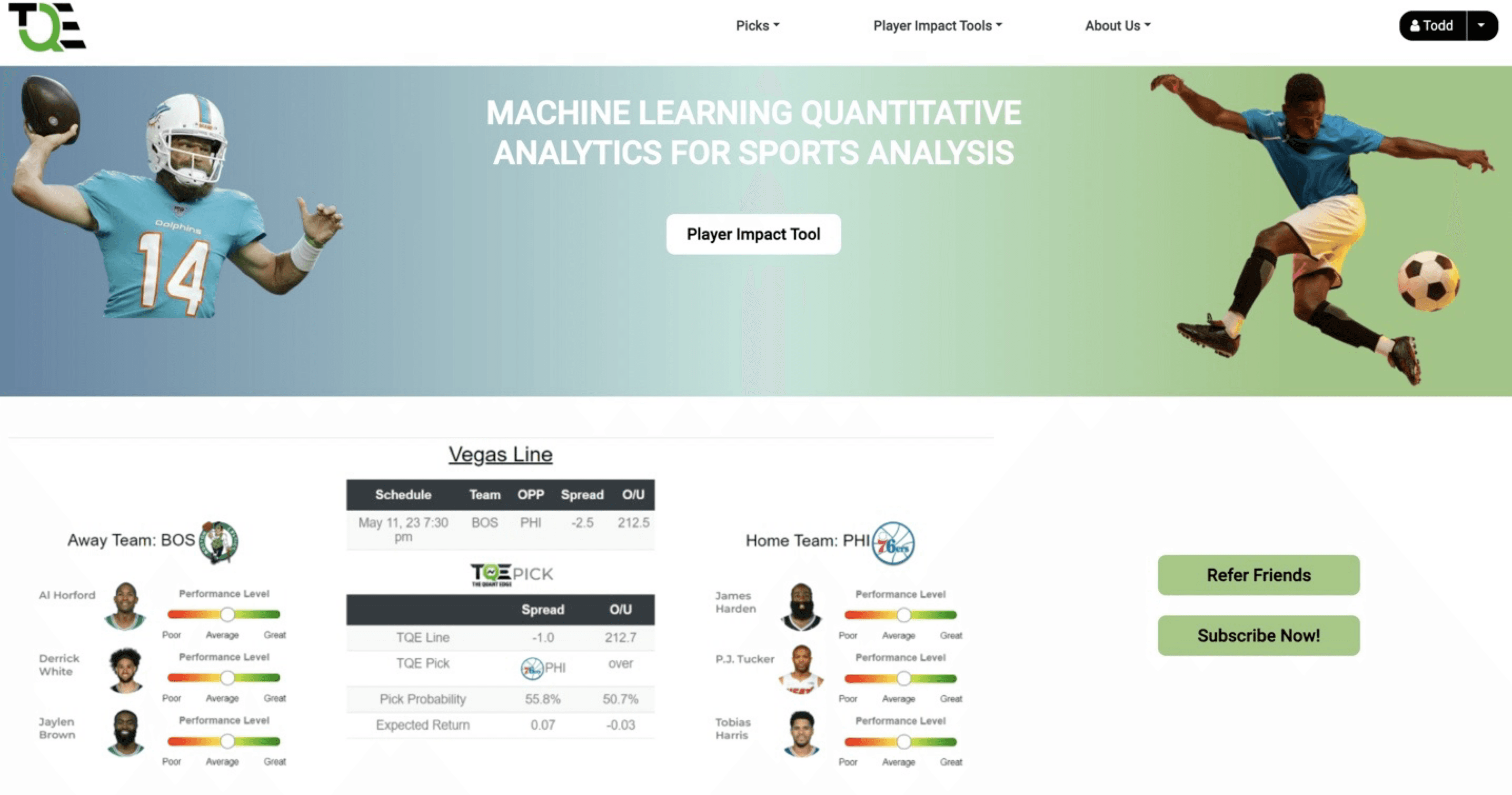
Before
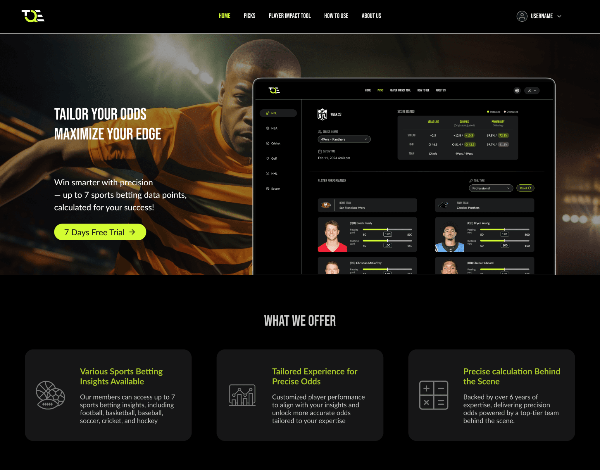
After
03 / Problem Analysis
Research Strategy

User Research
01.
Conducted interviews with different user groups, including long-term members (6+ months) and new users, to understand their pain points and experience with the tool.
Design Critique
02.
Since the previous website lacked analytics tools for tracking data, I reviewed all existing screens and evaluated them based on accessibility, readability to identify areas for improvement.

Competitor Analysis
03.
Researched and analyzed similar websites to identify industry best practices and trends, incorporating the latest user interactions to create effective designs.
User Interviews & Summary
Conducted user interviews with both existing and new users to identify pain points, explore solutions, and establish success metrics.
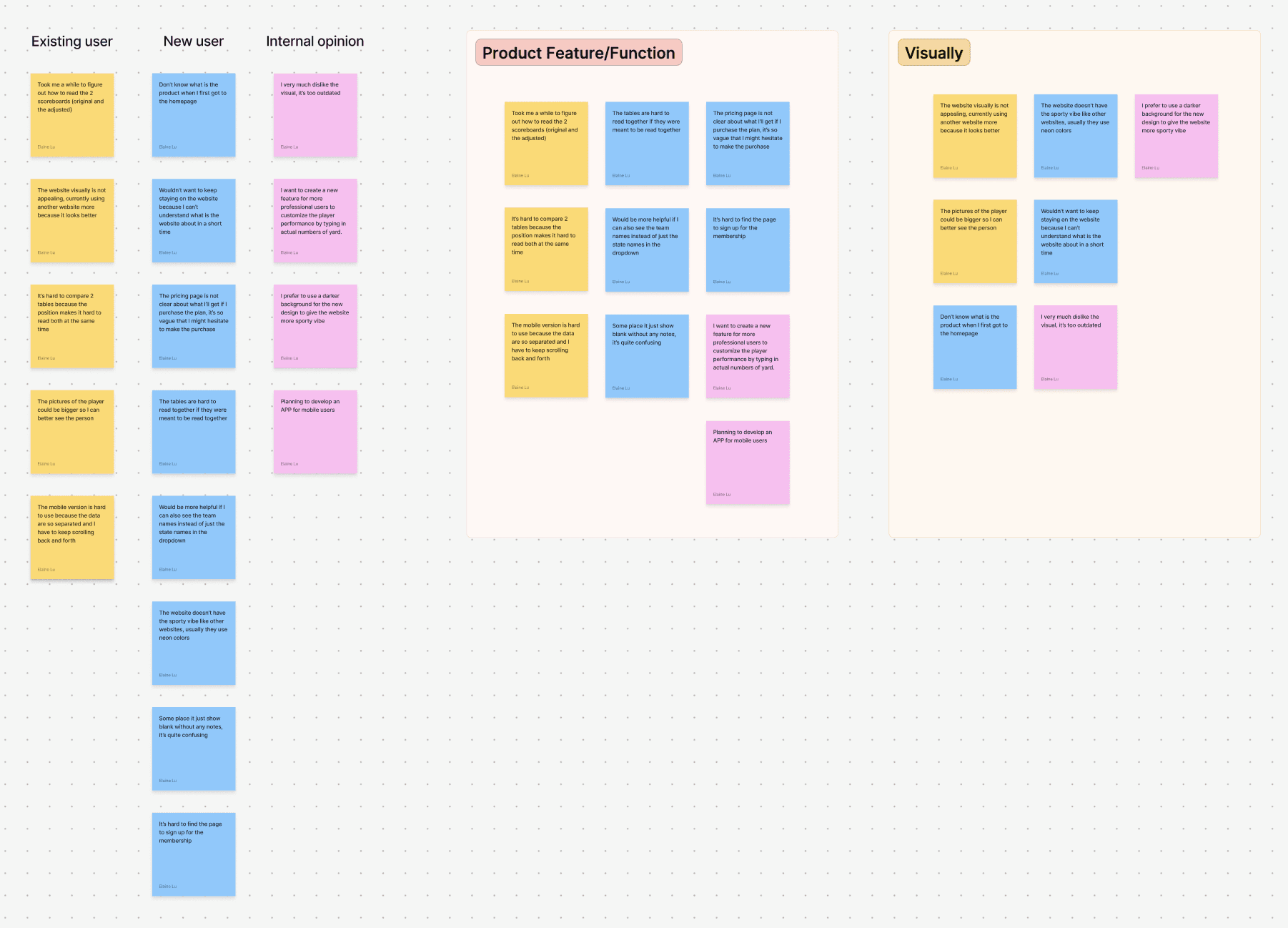
Design Critique
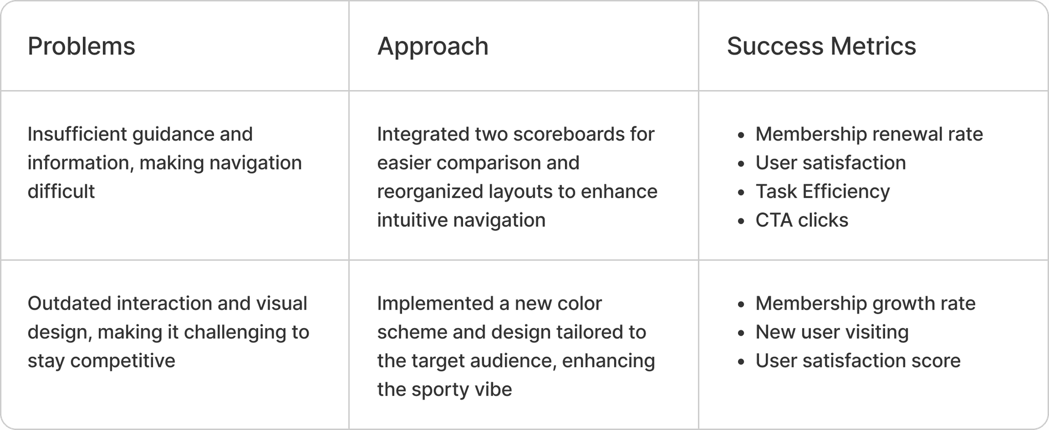
No hierarchy and lack of guidance
The information displayed lacks clear organization and proper labeling, leading to confusion and a poor self-navigation experience.
Outdated designs and no consistency
The overall design, user interaction, color scheme, and typography are inconsistent and visually unappealing, with awkward blank spaces affecting the layout.
Poor screen
responsiveness
Certain screens on the website are not responsive, making it challenging for users to view data on mobile devices.
04 / Design Showcase
New Branding Guideline
I explored various sports-related website designs and decided to switch to a dark mode color scheme with green neon accents to create a bold, sporty vibe that resonates more with our target audience.
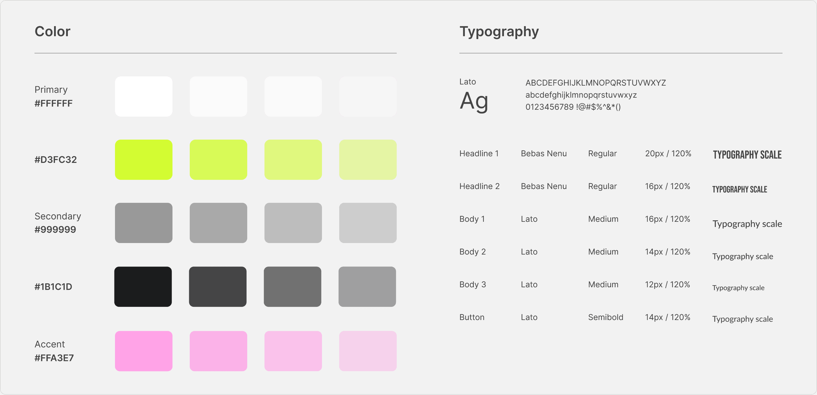
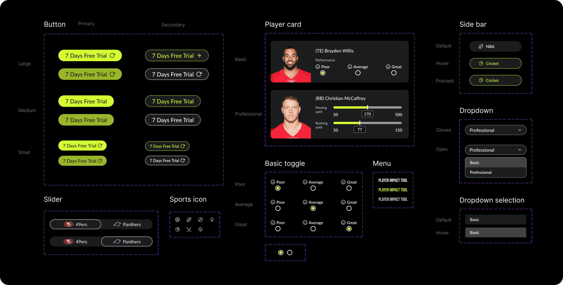
Design Systems
Developed a scalable design system to improve efficiency for future design and engineering teams.
Key Screens Makeover
01.
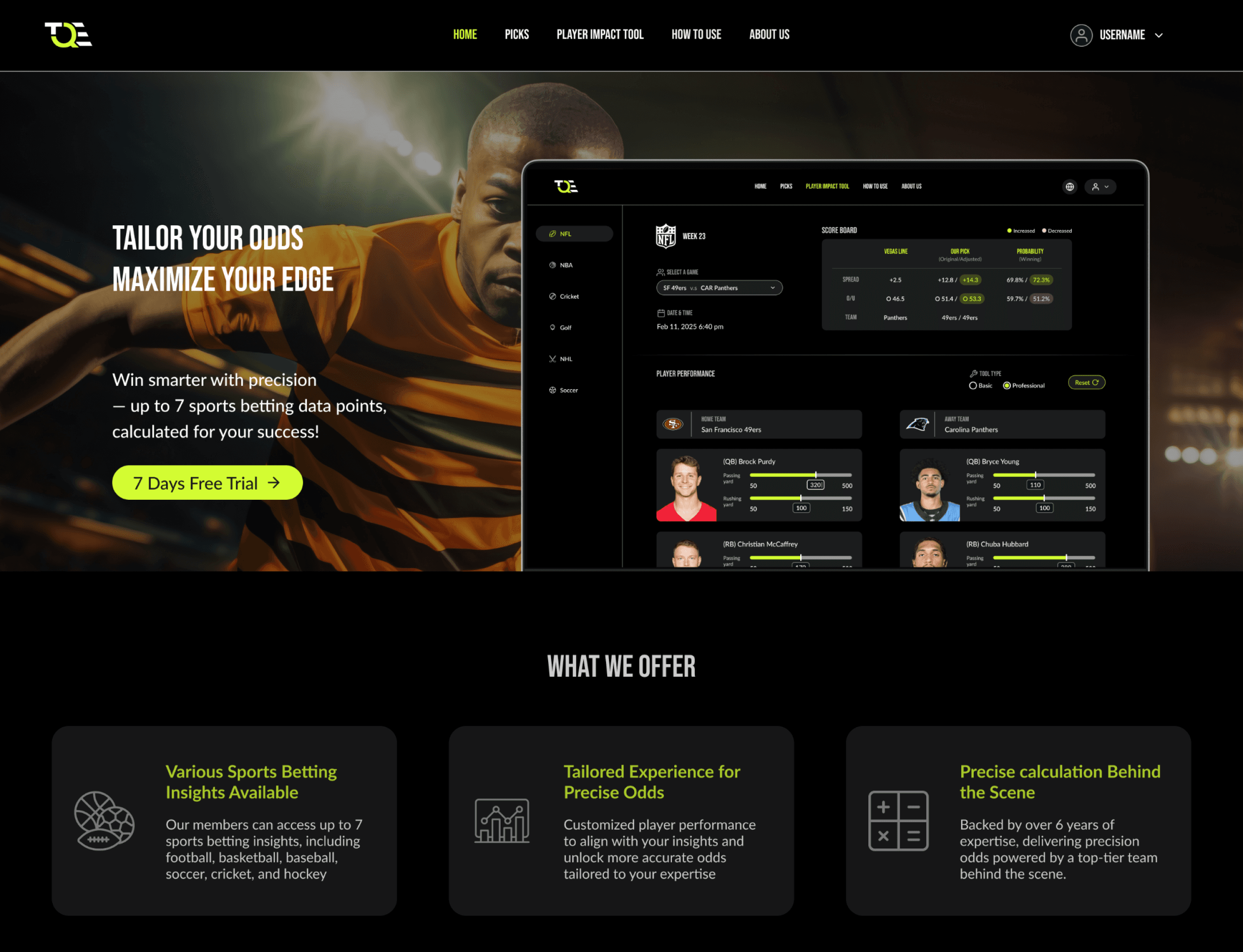
Homepage
Redesigned the homepage to emphasize the product demo, key selling points, and pricing plans, communicate with the users of the product effectively
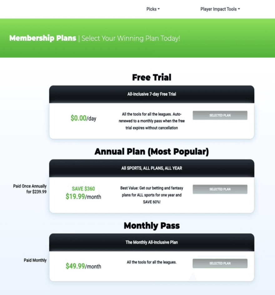
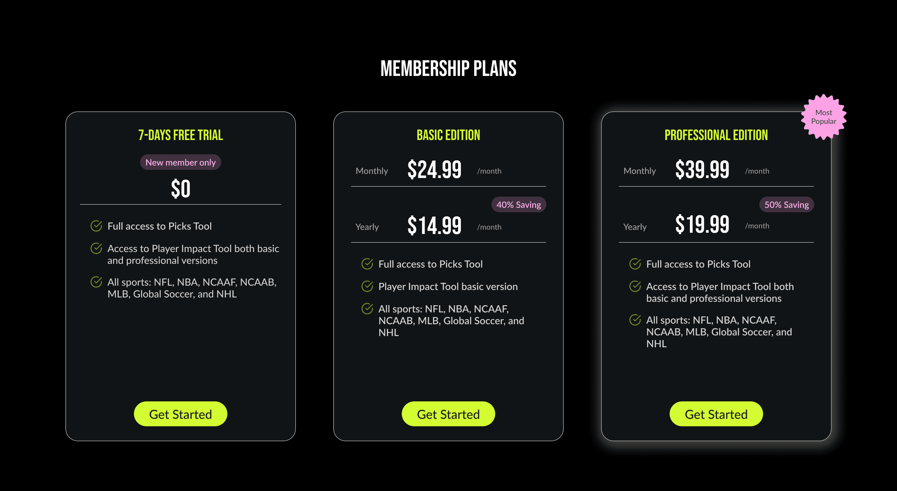
1-1. Pricing Plans
Added CTA buttons and plan comparison in bullet points to help user consume information sufficiently
Before
After
02.
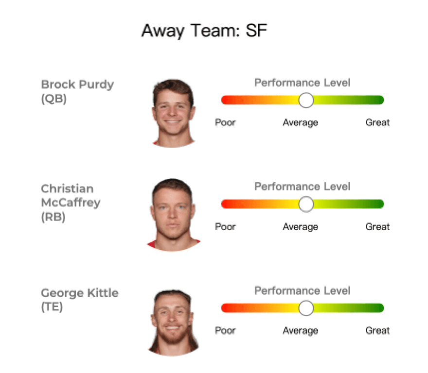
Player Impact Tool
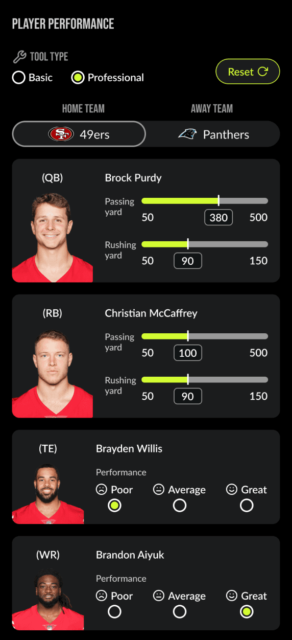
A feature enabling users to adjust player performance individually, generating personalized odds based on their preferences.
Introduced a Pro version with advanced controls, allowing users to fine-tune performance for two key team roles using sliders or manual input for greater precision.
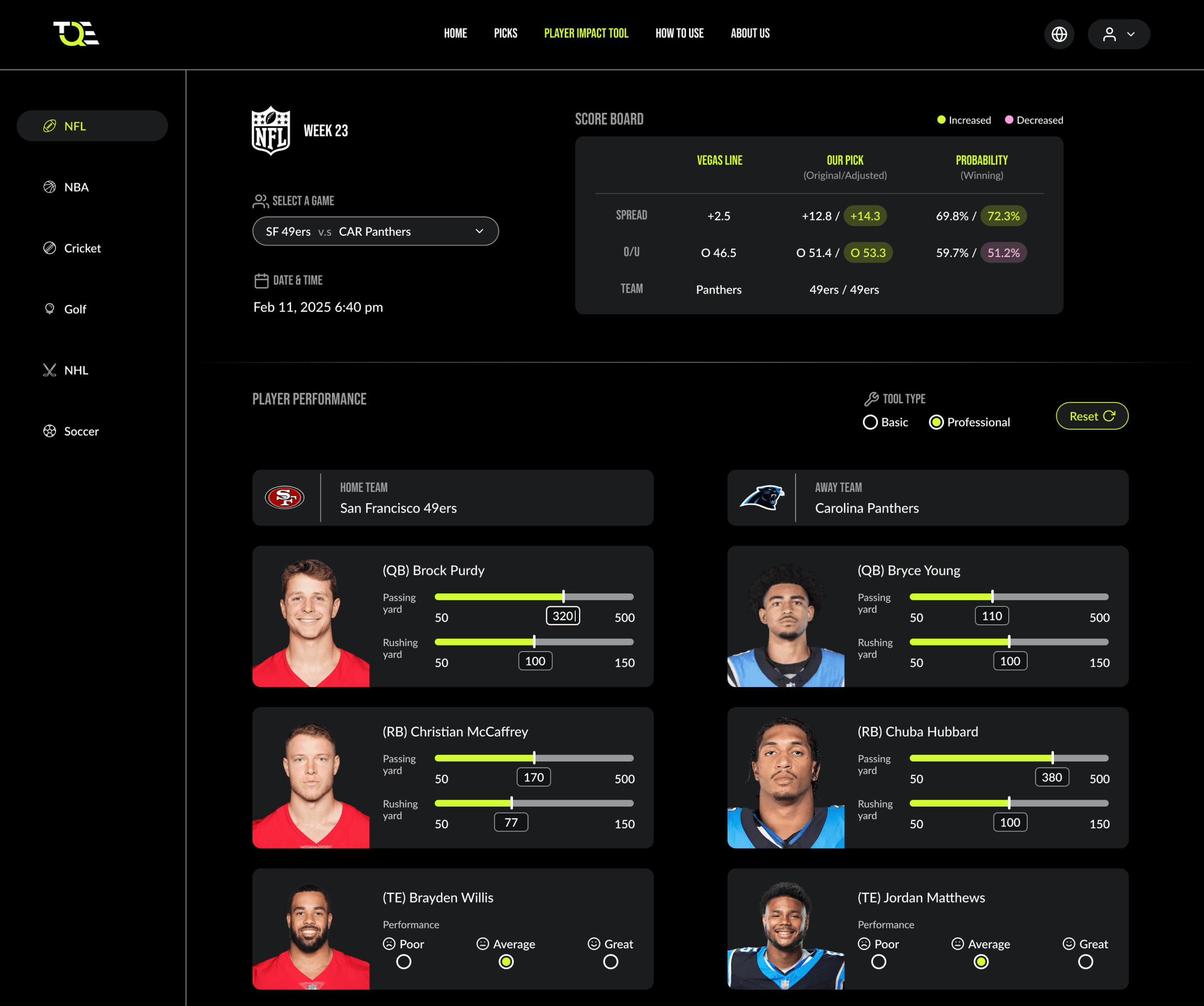
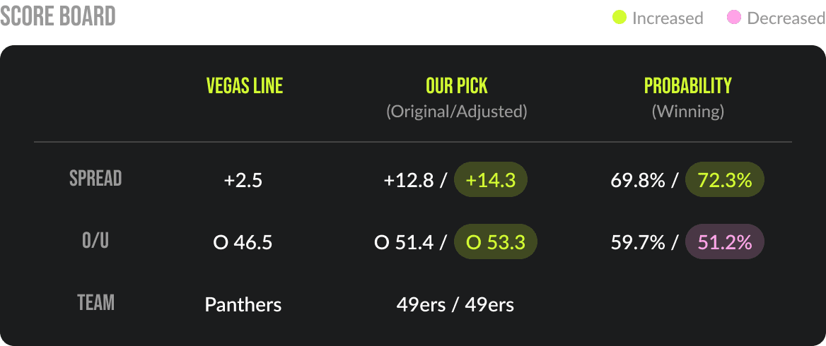
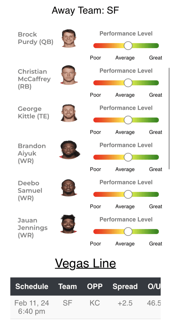
2-1. Score board
Streamlined information and reorganized layouts to improve readability for two data sets, using color-coded highlights to help users quickly distinguish increases and decreases
Before
After
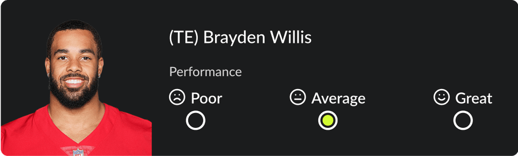
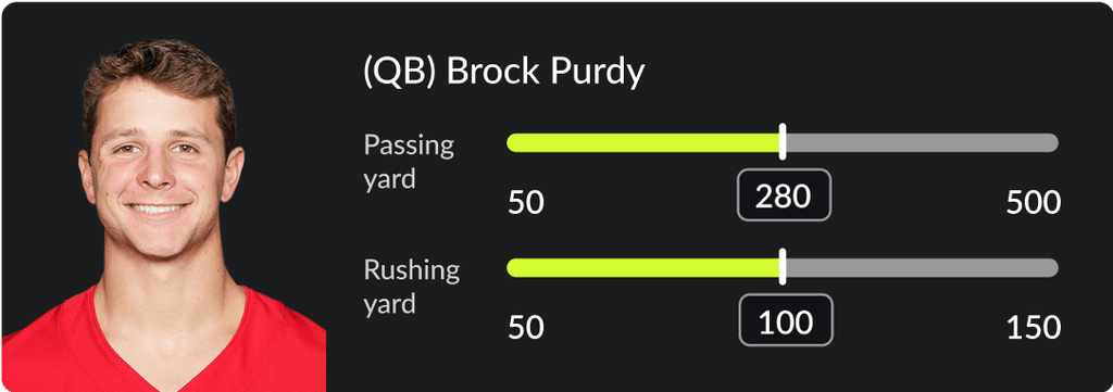
2-2. Player card
Redesigned interactions to enhance intuitiveness: radio buttons for 3 options, slider & input for wider number range of yards
Before
After
Basic version
Professional version
2-3. Mobile version
Implemented toggle design to enable switching between teams in order to minimize scrolling
Before
After
Froze the scoreboard on the top for easier readability as well as minimize scrolling
03.
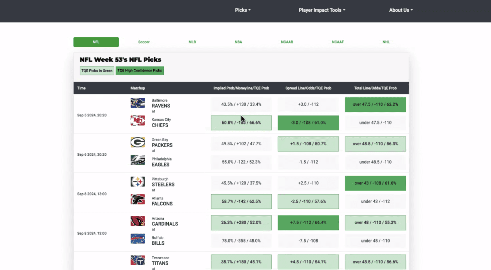
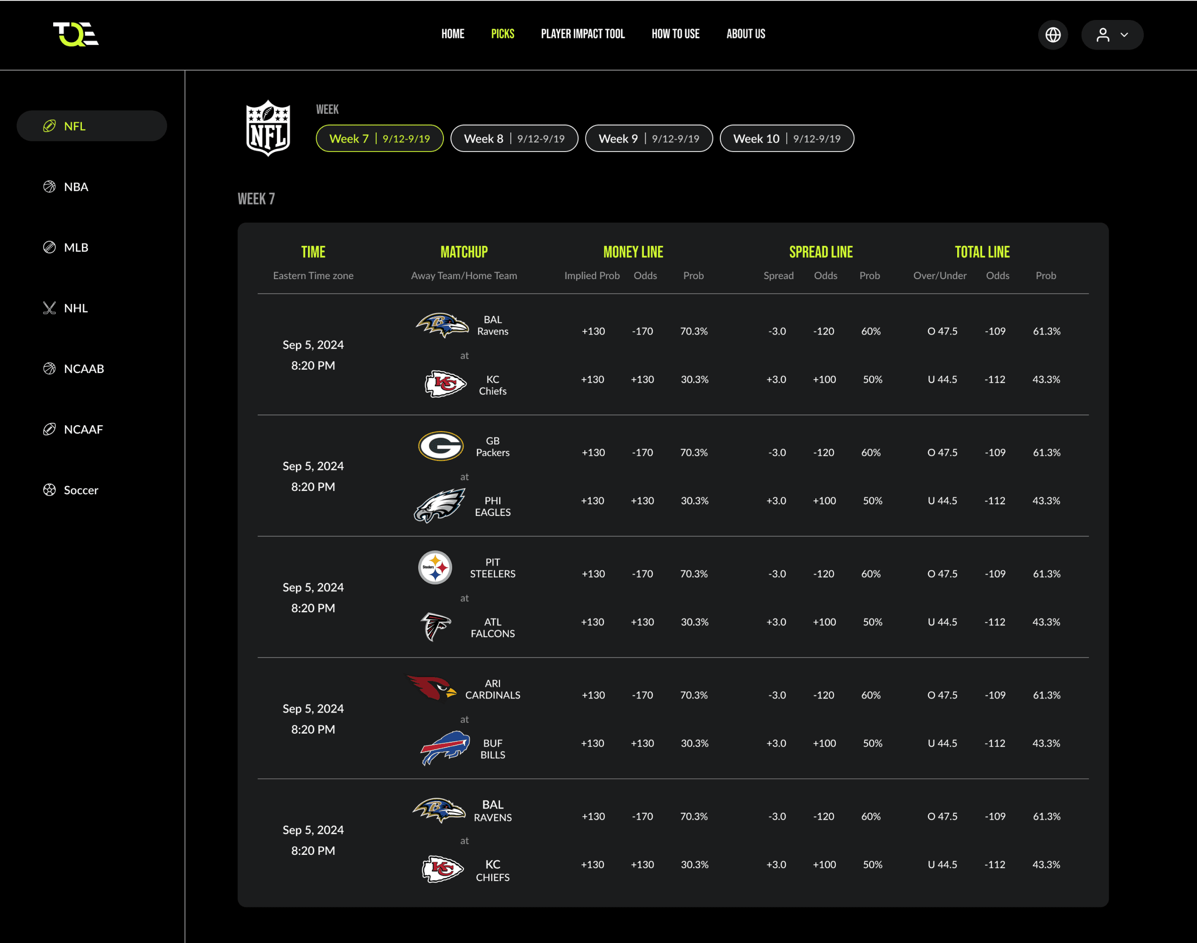
Picks
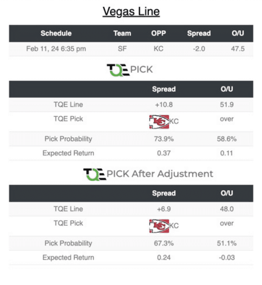
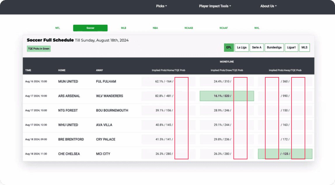
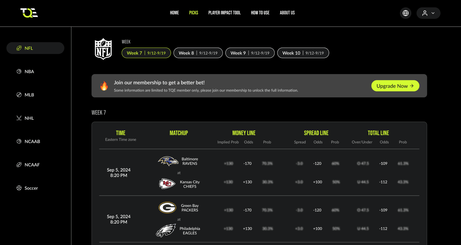
Picks is a tool that provides users with data on money lines, spread lines, and total lines for both teams in each game, helping them make more informed bets.
While non-member users are only allowed to see partial information.
3-1.
Displaying non-accessible information
Before
After
Painpoints
Users were confused by the blanks with no explanation or context and were unsure how to access the hidden information
Improvement
Keep the numbers on the screen but blurred it out
Add an informative banner with a CTA to encourage users to join the membership.
05 / Result
Feedback
“ The new look and feel is amazing, we really appreciate your effort and not just designing what we asked for but always surprise us with something unexpected “
- Todd, CEO
“ Definitely enjoying the new website with great responsiveness, I can now use it properly on my phone when I’m betting in the bars.”
- Eric, Member
“ Love how the scoreboards are combined, the colors highlights helps me to identify the odds quickly if I have to look for multiple NFL games. ”
- Jake, Member